Alight Motion Color Grading Guide for Beginners
Introduction to Color Grading in Alight Motion
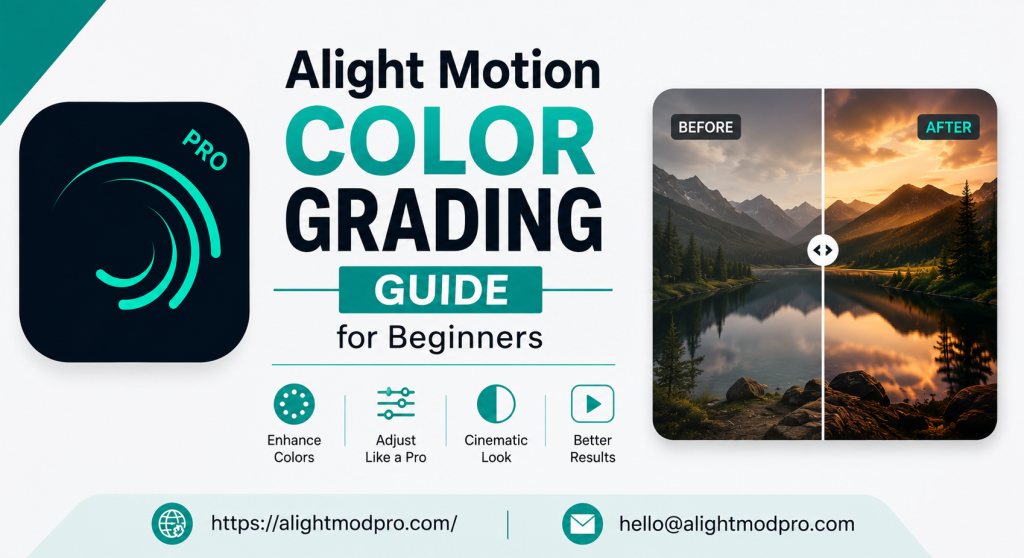
Color grading enhances video colors to create mood and style. For beginners in Alight Motion, color grading transforms ordinary clips into professional content. Whether creating social media videos or YouTube content, mastering color grading boosts production quality. Alight Motion offers powerful color tools for fine-tuning hue, saturation, brightness, and contrast on individual layers. This guide covers everything from basic concepts to advanced techniques.
Understanding the Basics of Color Grading
What is Color Grading?
Color grading adjusts video colors to achieve a desired look. It goes beyond color correction which fixes technical issues. Color grading is creative expression—setting mood, evoking emotions, and establishing visual identity. Professional creators use color grading to make footage cinematic and cohesive. Alight Motion provides professional-grade tools once only available on desktop software. Applying warm tones creates cozy feelings while pushing blues produces modern cinematic looks. High contrast deepens shadows for drama and desaturation creates editorial styles.
Color Correction vs. Color Grading
Color correction fixes technical issues like exposure and white balance. This ensures footage looks natural and consistent as a starting point. Color grading applies creative choices for desired mood or aesthetic. In Alight Motion, Color Tune effect creates cinematic looks without altering original color relationships. Follow a workflow starting with luminance adjustment, then color balancing, and finally building your look. Use Color Tune twice per layer—once for correcting inconsistencies and once for creative grading.
Essential Color Grading Tools
Color Tune Effect
Color Tune powerfully adjusts dark and light parts segmented by Lift, Gamma, and Gain. Lift controls affect dark parts more strongly than light parts. Gamma controls affect midtones more than dark or light parts. Gain controls affect light parts more strongly than dark parts. Offset controls overall color and lightness of the layer. Each control has hue angle, strength length, and luminance slider. For cinematic looks, push lift towards cyan and gain towards orange or yellow.
Color Temperature Effect
Color Temperature corrects or creatively adjusts warmth or coolness of footage. It corrects images to appear illuminated by different color temperature light sources. For white balancing, apply the effect and adjust Temperature until whites appear correct. For mood adjustment, freely adjust Temperature and Strength—higher values produce cooler blue light, lower values produce warmer red light. This effect is invaluable for correcting white balance or changing scene mood.
Colorize Effect
Colorize changes layer color while keeping original luminance intact. It overrides colors while maintaining brightness information. Use the color disc to adjust tint—angle determines hue and distance determines strength. At center, existing colors remain unchanged; at edge, colors are replaced with selected hue. Colorize works well for making layers look like colored glass, single-color ink, or harsh monochromatic light. Unlike Color Tune which nudges colors subtly, Colorize affects all pixels equally for dramatic transformations.
Channel Remap Effect
Channel Remap remaps red, green, blue, and alpha channels in your layer. For each output channel, select which input channel to use. Convert layers to grayscale by setting R, G, and B to Y (luminance). This effect is useful for creating masks or generating black-and-white versions. The luminance formula is Y = R * 0.2126 + G * 0.7152 + B * 0.0722. While complex for beginners, Channel Remap offers powerful creative possibilities once understood.
Step-by-Step Workflow
Step 1: Luminance Adjustment
Start by adjusting exposure and contrast for your footage. Use effects like Highlights and Shadows, Brightness/Contrast, or Exposure/Gamma. Alternatively use luminance sliders for Lift, Gamma, and Gain. Avoid moving sliders too far to prevent clipping and loss of detail. The goal is achieving a clean, balanced foundation for creative grading.
Step 2: Color Balancing
Match colors of different clips for consistency in your project. Use Color Temperature or color discs in Lift, Gamma, Gain, and Offset. Color balancing is crucial when working with footage shot under different lighting conditions. Ensure all clips look like they belong together before applying creative grading. This step ensures professional, cohesive appearance for your final project.
Step 3: Building a Look
Apply your creative stylistic choices after luminance and color balance adjustments. For natural-looking footage, stick with subtle adjustments in hue discs. Popular looks include pushing lift towards cyan and gain towards orange or yellow. Experiment with combinations to achieve various moods—warm tones for coziness, cool tones for modern feel, high contrast for drama, or desaturation for editorial style.
Practical Tips for Beginners
Start with Presets
Using presets helps beginners understand color grading techniques. Many creators share color grading presets for Alight Motion. Apply presets and tweak them to learn how adjustments affect footage. The Alight Motion community offers presets for dark color CC, cold CC, and high-quality 4K CC. Hands-on experience with presets is one of the most effective learning methods.
Use Keyframes for Dynamic Changes
Keyframes animate property changes including dynamic color grading. Animate color temperature to transition from warm to cool gradually. Add keyframes by setting property value and tapping the diamond icon. Move playhead forward, change property value, and Alight Motion automatically animates between points. This technique creates dynamic, evolving color looks enhancing storytelling dramatically.
Maintain Performance
Color grading effects can strain your device when applied to multiple layers. Turn off layers you are not currently working on using visibility icons. Use effects wisely—heavy effects include Shadow, Glow, and various Blur effects. Use lighter alternatives or apply effects to fewer layers when possible. Enable low-quality preview on Android devices to reduce resolution without affecting exports.
Consistent Color Across Clips
Maintain consistent color when working with multiple images or video layers. Use Color Tune twice for each layer—one for compensating inconsistencies and one for creative look. Copy and paste look settings to other layers for consistent aesthetic. This workflow saves time and ensures professional, cohesive appearance across your project.
Common Color Grading Looks
Teal and Orange Look
Teal and orange is popular in modern cinema and social media content. Push lift towards cyan and gain towards orange or yellow. This creates complementary color contrast making subjects stand out. Human skin tones naturally fall into orange spectrum while teal provides cool backdrop. This look works effectively for outdoor scenes evoking different illumination feelings.
Warm and Cozy Look
Increase reds and oranges while reducing cooler tones for warm coziness. This aesthetic works for lifestyle content, vlogs, and nostalgic scenes. Adjust Color Temperature towards warmer values or push gamma and gain towards warm hues. The result is comfortable, inviting atmosphere making viewers feel at ease. For outdoor scenes, adjust Lift and Gain in opposite directions and boost luminance.
Cool and Moody Look
Push blues and teals for modern cinematic feel in dramatic content. Adjust Color Temperature towards cooler values and desaturate slightly for muted editorial appearance. High contrast works well deepening shadows and brightening highlights for drama. This style is effective for urban scenes and storytelling videos.
Black and White Look
Desaturate footage for timeless artistic aesthetic using Channel Remap. Set R, G, and B channels to Y (luminance) for black-and-white look. For partial desaturation, use Color Tune to reduce color strength while maintaining some hue. This look emphasizes composition and lighting over color effectively.
Pastel Aesthetic
Pastel aesthetic is popular for fashion, beauty, and lifestyle social media content. Reduce contrast, soften colors, and apply gentle color overlays. Use Colorize to apply pastel tint while maintaining original luminance. Use Color Tune to push colors towards softer hues by adjusting gamma and lift controls. The result is dreamy, ethereal look appealing on Instagram and TikTok.
Advanced Techniques
Animated Color Changes
Create dynamic color transitions evolving throughout your video with keyframes. This technique works effectively for music videos, promotional content, and storytelling. Add keyframes at different timeline points with varying property values. Animate Color Temperature from warm to cool reflecting mood changes. When animating Tint property, hue and strength components tween independently.
Layered Color Grading
Apply multiple color effects to the same layer for complex grading. Use Color Tune for basic look, Colorize for specific tint, and Channel Remap for channel swapping. Each effect builds upon previous ones allowing sophisticated color transformations. Be mindful of performance as multiple effects can strain your device. Turn off layers when not working on them to maintain smooth preview.
Using Blending Modes
Blending modes influence color and appearance of layers in Alight Motion. Experiment with different blending modes for interesting color interactions. “Overlay” blending mode combines colors creating more vibrant results. Use blending modes alongside color grading effects for complex visual styles. All color adjustments render in final exported video.
Color Matching for Multiple Clips
Color matching is essential for continuity in projects with multiple clips. Use one Color Tune instance to correct each clip individually for consistency. Create second Color Tune instance for creative look and copy settings to other layers. This workflow ensures unified color aesthetic across your entire project. Visual consistency is key for narrative projects maintaining immersion.
Frequently Asked Questions
Conclusion
https://alightmodpro.com/Color grading in Alight Motion opens creative possibilities for video creators. Understanding essential tools—Color Tune, Color Temperature, Colorize, and Channel Remap—transforms footage from ordinary to extraordinary. Follow structured workflow: luminance adjustment, color balancing, and creative look building. Experiment with presets and tutorials from the Alight Motion community. Practice builds confidence in achieving professional-quality color grades. Whether aiming for cinematic teal-and-orange, warm coziness, or cool moodiness, Alight Motion provides all tools needed. With these techniques, you can begin your color grading journey. Start with simple adjustments and gradually incorporate advanced tools. Let your creativity guide you in developing unique visual style. The skills you gain will elevate your content and set you apart as a creator. Happy editing