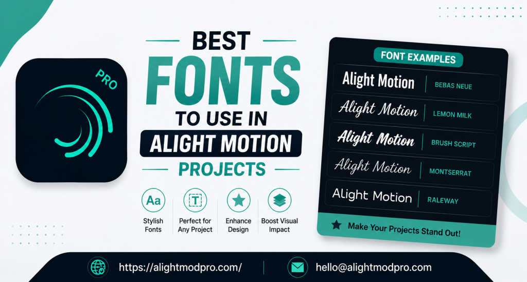
Best Fonts to Use in Alight Motion Projects
Introduction to Typography in Alight Motion
Typography plays a vital role in video editing and motion graphics projects. The right font choice can elevate your content from ordinary to professional instantly. Alight Motion comes with a built-in collection of fonts suitable for various creative purposes. You can also import external fonts if the default options don’t match your project requirements.
Whether creating social media videos, lyrical status edits, or motion graphics, selecting appropriate fonts enhances visual storytelling. Good typography helps convey your message clearly while maintaining viewer engagement. Fonts contribute significantly to the overall aesthetic and professional appearance of your final output.
Understanding Font Selection
Why Font Choice Matters
Fonts communicate mood and personality in your video projects. Bold, impactful fonts work well for attention-grabbing titles and energetic content. Clean, elegant fonts suit professional and minimalist designs with sophisticated appeal.
The right typography helps convey your message clearly and professionally to viewers. Fonts also contribute to brand identity and viewer engagement across multiple platforms. Consistent font usage builds recognition and trust with your audience over time.
Where to Find Fonts
Alight Motion includes a library of built-in fonts ready for immediate use. You can access all available fonts through the font selection menu within the app. Many creators also import custom fonts from external sources for unique styles.
Online forums and tutorial channels provide font suggestions with download links. Telegram and WhatsApp groups often host font collections for editors. Building a diverse font library enhances your creative possibilities significantly.
Understanding Font Categories
Fonts generally fall into several distinct categories based on their design characteristics. Serif fonts feature decorative strokes at letter ends and convey traditional elegance. Sans-serif fonts lack these strokes and appear clean, modern, and highly readable.
Display fonts are decorative and designed specifically for headlines and titles. Monospace fonts have uniform character width suitable for technical or retro aesthetics. Understanding these categories helps you select appropriate fonts for different project types.
Top Fonts for Different Project Styles
Bold and Impactful Fonts
Bold fonts command attention and work well for action videos and energetic content. These fonts help text stand out against busy backgrounds with maximum visibility. Popular choices include strong sans-serif styles with clean, thick lines.
These fonts pair well with dynamic animations and keyframe effects in projects. Bold typography creates immediate visual impact and grabs viewer attention instantly. Use bold fonts for titles, headlines, and call-to-action elements.
Clean and Modern Fonts
Clean fonts suit professional videos, corporate content, and minimalist designs perfectly. Sans-serif fonts like Arial Narrow and Lemon Milk receive frequent recommendations from editors. These fonts offer excellent readability across different screen sizes and resolutions.
Clean fonts maintain a polished appearance even with animation and effects applied. Modern fonts help establish a contemporary, professional brand identity for creators. Clean typography ensures your message remains clear and professional.
Decorative and Creative Fonts
Decorative fonts add personality and unique style to creative video projects. Cute and aesthetic fonts are popular for lifestyle, fashion, and social media content. These fonts can be paired with color grading and glow effects for enhanced appeal.
Use decorative fonts sparingly to maintain readability throughout your project. Creative fonts work best for titles, headings, and special emphasis elements. Balance decorative fonts with clean fonts for professional results.
Hindi and Regional Language Fonts
Hindi fonts have gained significant popularity for regional content creation projects. These fonts support lyrical status videos and culturally relevant content formats. Installing and using Hindi fonts gives editors creative advantages for diverse audiences.
This trend reflects the growing diversity of content creation across platforms. Regional fonts help creators connect with local audiences more effectively. Support for multiple languages expands your content’s reach and accessibility.
Script and Handwritten Fonts
Script fonts mimic handwriting styles and add personal, intimate touches to projects. These fonts work well for romantic, emotional, and creative content themes. Handwritten fonts create a human, approachable feel for personal branding projects.
Script fonts are popular for wedding videos, personal vlogs, and artistic content. Use script fonts for short text elements to maintain readability. Script typography creates emotional connections with viewers.
Using Fonts Effectively
Pairing Fonts Correctly
Combining multiple fonts creates visual hierarchy and interest in your projects. Use one bold font for headlines and another clean font for body text. Ensure font pairs complement each other without visual clashing or confusion.
Experiment with different combinations to discover unique visual styles. Consider contrast when pairing fonts for maximum visual impact. Good font pairing enhances readability and overall design quality.
Font Size and Readability
Maintain appropriate font sizes for your target viewing platform and audience. Smaller text may be unreadable on mobile screens with limited resolution. Use larger sizes for key messages and smaller sizes for supporting text.
Ensure sufficient contrast between text color and background elements. Test your text readability on different devices before final export. Readability should always take priority over decorative font choices.
Customizing Font Appearance
Alight Motion offers text customization options beyond basic font selection. Adjust opacity for subtle text integration with video backgrounds and scenes. Modify stroke colors to enhance visual appeal of text elements significantly.
Use gradients for modern, dynamic text effects that catch viewer attention. Add shadows and outlines for improved visibility against complex backgrounds. Text styling transforms basic fonts into stunning visual elements.
Text Animation Techniques
Animate your text using keyframes for dynamic, engaging visual presentations. Apply scale animations for text that grows or shrinks during the video. Use position animations to move text across the screen smoothly.
Apply opacity fades for smooth text transitions between scenes. Consider using preset text animations available in Alight Motion. Animation adds energy and professionalism to your typography.
Installing External Fonts
How to Add Custom Fonts
Alight Motion allows importing fonts from external sources for greater variety. Download font files from trusted websites with appropriate licensing information. Save font files to your device’s storage in accessible folders.
Look for import buttons to add custom fonts to your library. The app’s versatility supports external fonts for enhanced creative freedom. Custom fonts expand your creative possibilities significantly.
Popular Font Resources
Many creators share font packs through social media communities and groups. TikTok and YouTube tutorials recommend specific font sources with links. Online font foundries offer both free and commercial font options.
Always verify font licenses before using in professional projects. Free font resources provide excellent starting points for beginners. Research thoroughly before downloading fonts from unknown sources.
Managing Font Storage
Limit the number of installed fonts to maintain app performance. Remove unused fonts periodically to free up storage space. Organize downloaded fonts in clearly labeled folders on your device.
Keep backup copies of favorite fonts for future projects. Regular font management prevents clutter and improves workflow efficiency. Well-organized font libraries save time during project creation.
Fonts for Specific Project Types
Lyrical Status Videos
Lyrical status edits benefit from fonts that match the song’s theme and mood. Bold and dynamic fonts suit energetic songs with fast-paced lyrics. Elegant and decorative fonts complement slow, emotional tracks effectively.
Experiment with font combinations for unique visual presentations. Match font colors to the video’s overall color palette for cohesion. Font choice significantly impacts the emotional response of viewers.
Motion Graphics and Animations
Text animations require fonts that remain readable during movement and effects. Clean sans-serif fonts work well for animated text with complex motions. Bold fonts maintain impact during scaling and rotation animation effects.
Lighter fonts may become hard to read with certain motion effects applied. Test text readability throughout the animation timeline. Consistent typography strengthens motion graphics projects significantly.
Social Media Content
Different platforms have varying typography trends and user preferences. Instagram and TikTok favor bold, eye-catching fonts for maximum engagement. YouTube thumbnails require strong, readable typefaces for click-through rates.
Consider your target platform when selecting appropriate fonts. Platform-specific font trends evolve regularly with design changes. Stay updated on current typography trends for social media success.
Promotional and Marketing Videos
Marketing content requires fonts that reflect brand identity and professionalism. Choose fonts that align with your brand’s personality and values. Use consistent fonts across all marketing materials for brand recognition.
Bold fonts work well for call-to-action text elements. Clean fonts maintain readability for detailed information and offers. Professional typography builds trust with potential customers.
Educational and Tutorial Content
Educational videos benefit from clean, highly readable fonts for information delivery. Sans-serif fonts work best for instructional content and explanations. Maintain consistent font usage throughout tutorial series for familiarity.
Use larger text for key concepts and definitions. Consider font contrast with backgrounds for optimal readability. Clear typography improves information retention for viewers.
Frequently Asked Questions
Conclusion
Selecting the right fonts dramatically impacts your Alight Motion projects and viewer engagement. Bold, clean, and decorative fonts each serve different creative purposes effectively. Built-in fonts provide immediate options while external fonts expand creative possibilities significantly.
Experiment with font combinations and customizations for unique visual results. Maintain readability and visual harmony throughout your edits consistently. With these font recommendations, you can enhance your video projects professionally.
Your typography choices will become an essential part of your creative toolkit. Proper font selection elevates content quality and audience perception. Happy editing with beautiful, effective typography in your Alight Motion projects.